Skeema

Do you have too many browser tabs open?
According to surveys conducted at Carnegie Mellon University:
55%
of users left tabs open because those tabs contained information that they may have needed or wanted to keep.
30%
of users reported having a “tab hoarding problem”
25%
of users said their open tabs were crashing or slowing their computers.
Why do you have so many browser tabs open?
The Human-Computer Interaction Institute and Knowledge Accelerator at Carnegie Mellon attempted to answer this by following the browsing habits of 10 people for two weeks. They discovered some common explanations for why people where leaving so many tabs open:

Offloading Information
They kept them open in an effort to lighten their mental load, and to act as a digital memory.

Quick References
They needed particular information for quick reference repeatedly.

Potential Opportunities
They also saw their open tabs as opportunities to improve their lives.
“They’re kind of like opportunities for a better life: gathering more knowledge, getting a better job, becoming enlightened. People are queuing up these things and hoping to get to them because no one likes to lose out on opportunities. And when you close a tab that you’ve yet to consume, that opportunity seems lost forever”

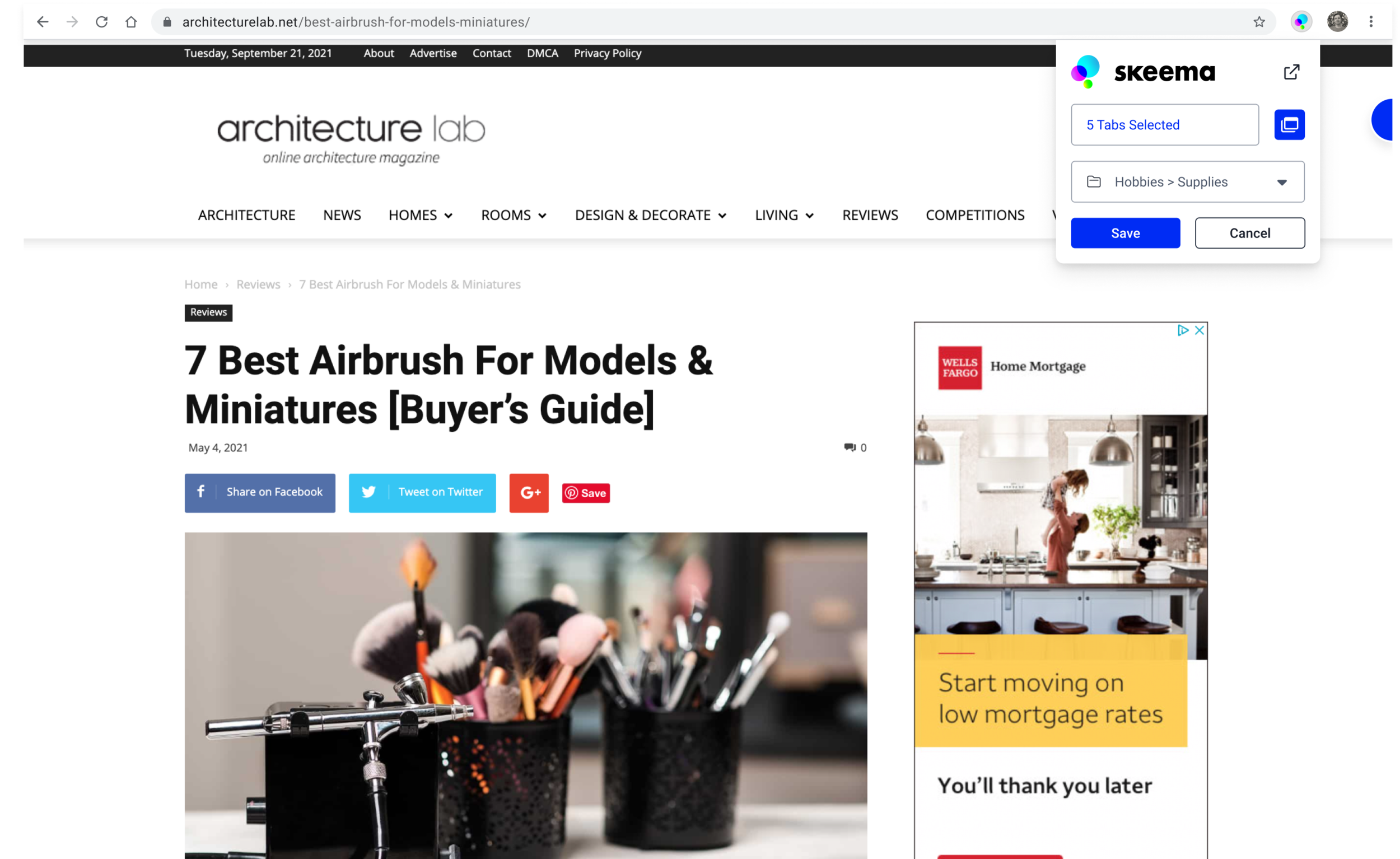
Enter Skeema
Using insights gained from this research as well as additional surveys from over 100 people, the team at The Knowledge Accelerator at CMU built Skeema and distributed it to early-access users for testing and more feedback.
Skeema attempts to help you clean up your digital workspace by providing users with a system of grouping, labeling, and prioritization features for saved web content. Saving tabs in Skeema automatically closes them in your browser.

Challenges
Skeema faced challenges in transitioning from academic research project to product.

Engagement
Some users were overwhelmed upon installing and opening Skeema. They couldn’t figure out how to use it, and abandoned the tool.

Competition
Skeema’s users were already familiar with more versatile, feature packed tools and to-do apps such as Notion and Airtable.
Role
Over the course of a 3 month contract, I worked on improving the over-all user experience and interaction design for the core functions of the existing Skeema chrome extension. This included building out a design system to insure consistency across design patterns. I also participated in user interviews to identify pain points that could be improved with design updates.
Our Process
In order to quickly make updates and build new features our team used the following design methods within two week long sprint iterations.

User Feedback
We talked with users frequently to form ideas for updates and new features. These observations informed new sprint tickets as well as our User Journeys.

User Journeys
We constructed scenarios for using Skeema such as doing development research for work, gathering sources for a paper, planning a trip, or shopping for a new car.

Competitive Research
We looked to competitors as benchmarks for common patterns as well as potential new features.

Analogous Research
We looked to products from other industries for design patterns to solve similar problems.

UX Sketching
Multiple sketched concepts would be submitted for each respective design solution and reviewed internally before consolidating in to a single design.

Visual Design
Mockups and prototypes were constructed in Figma, with certain interactions built out as clickable prototypes. As designs were approved internally, the UI kit library was updated with any new components.
Design Improvements
Onboarding
Feedback: Users either didn't know how to use Skeema or didn’t understand what it was for.
Insight: Competitive research revealed that similar applications use a combination of carousels and tour points to introduce users to features.
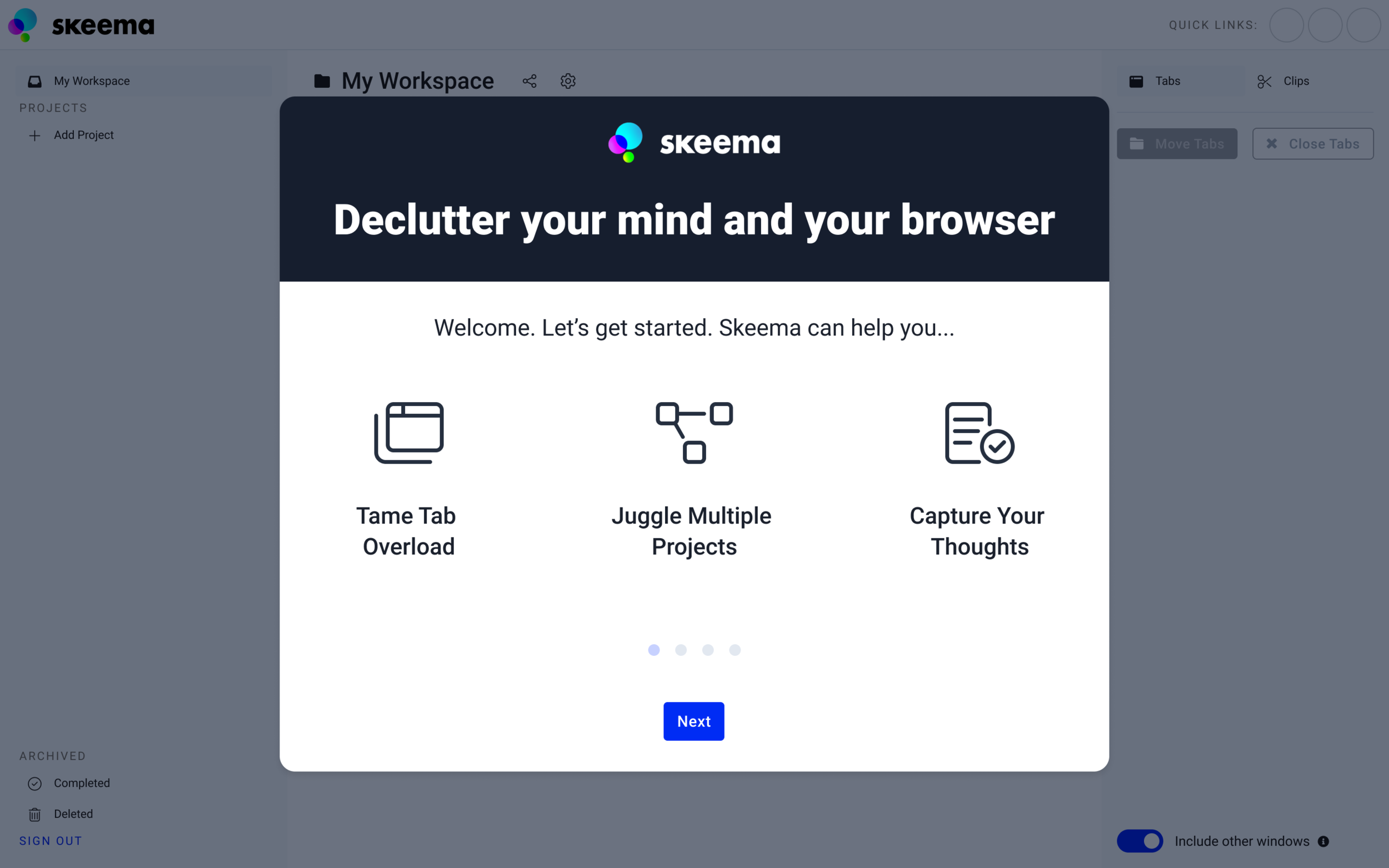
Intro Carousel
The onboarding carousel was updated to state the purpose and value of Skeema for new users. Animated GIFs were deployed on slides to help explain features.
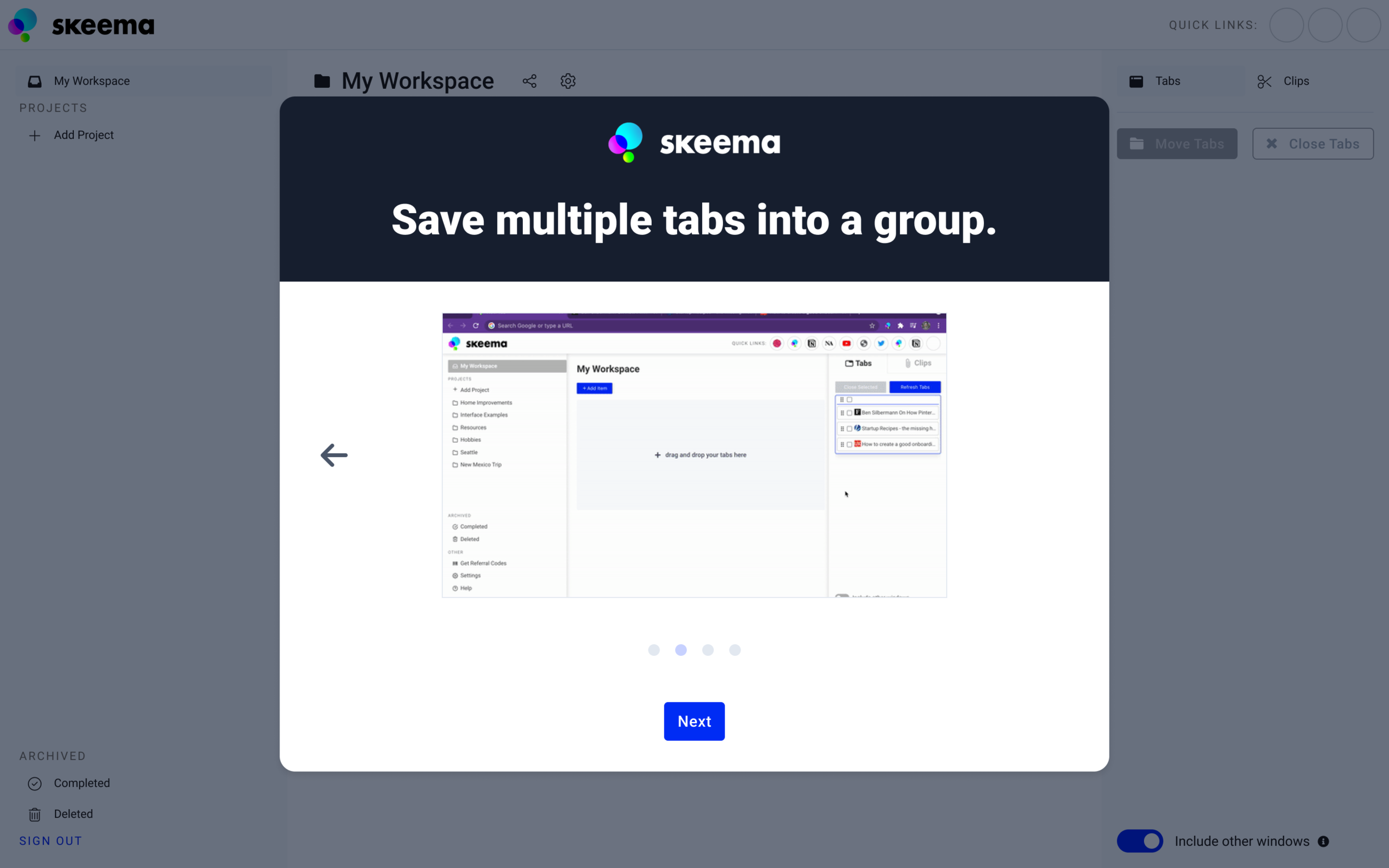
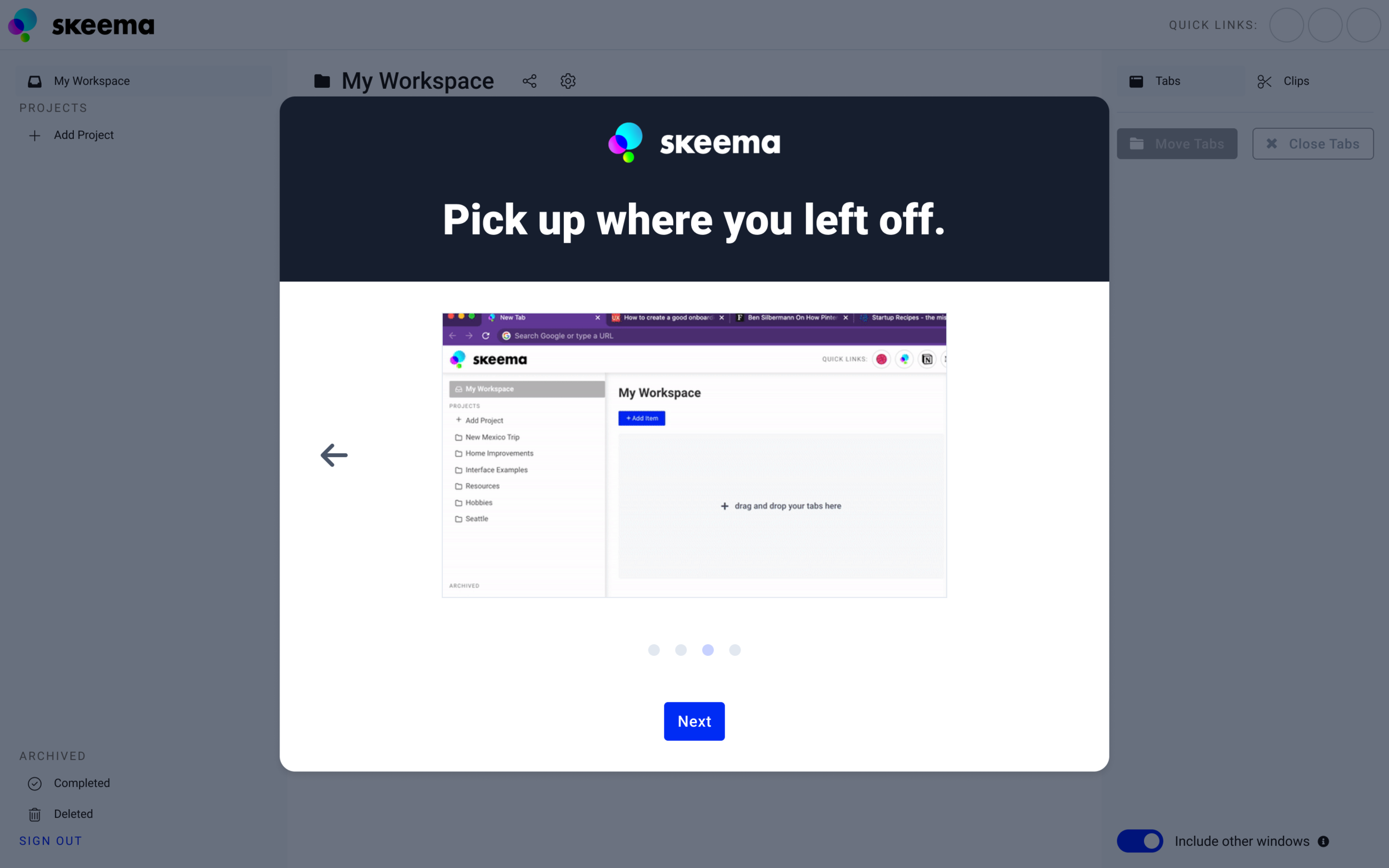
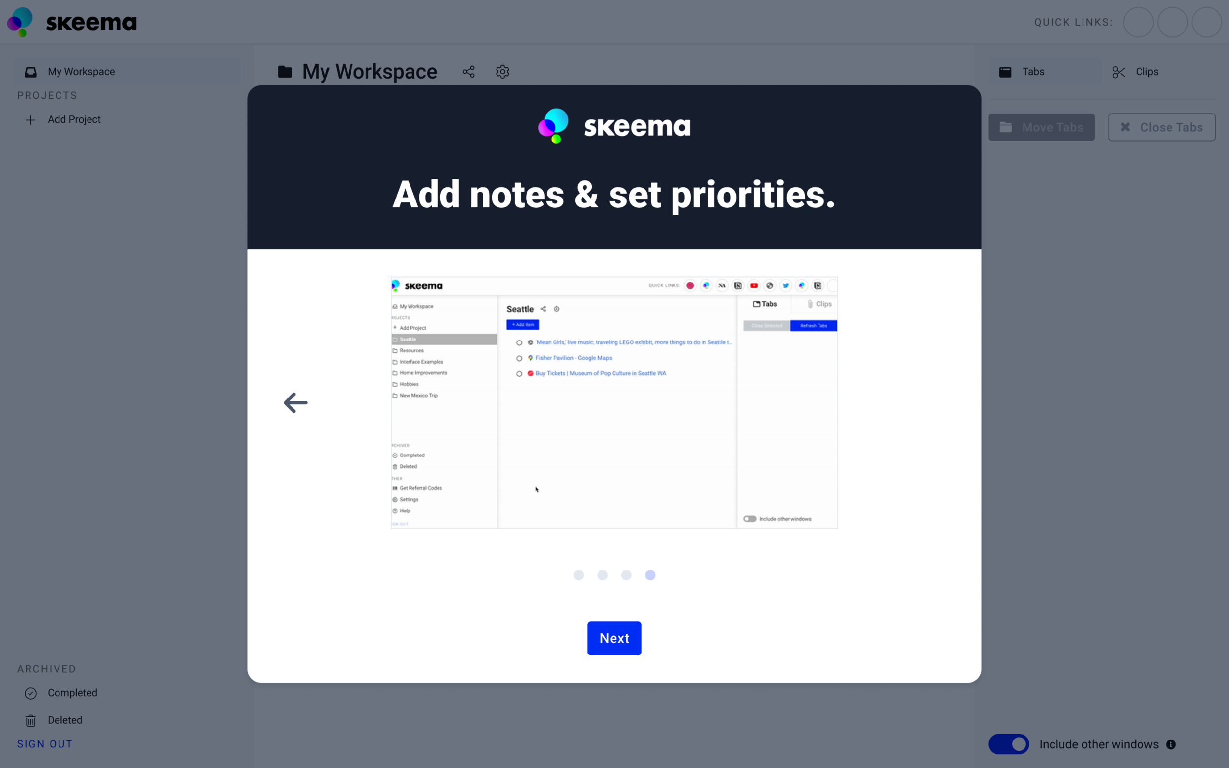
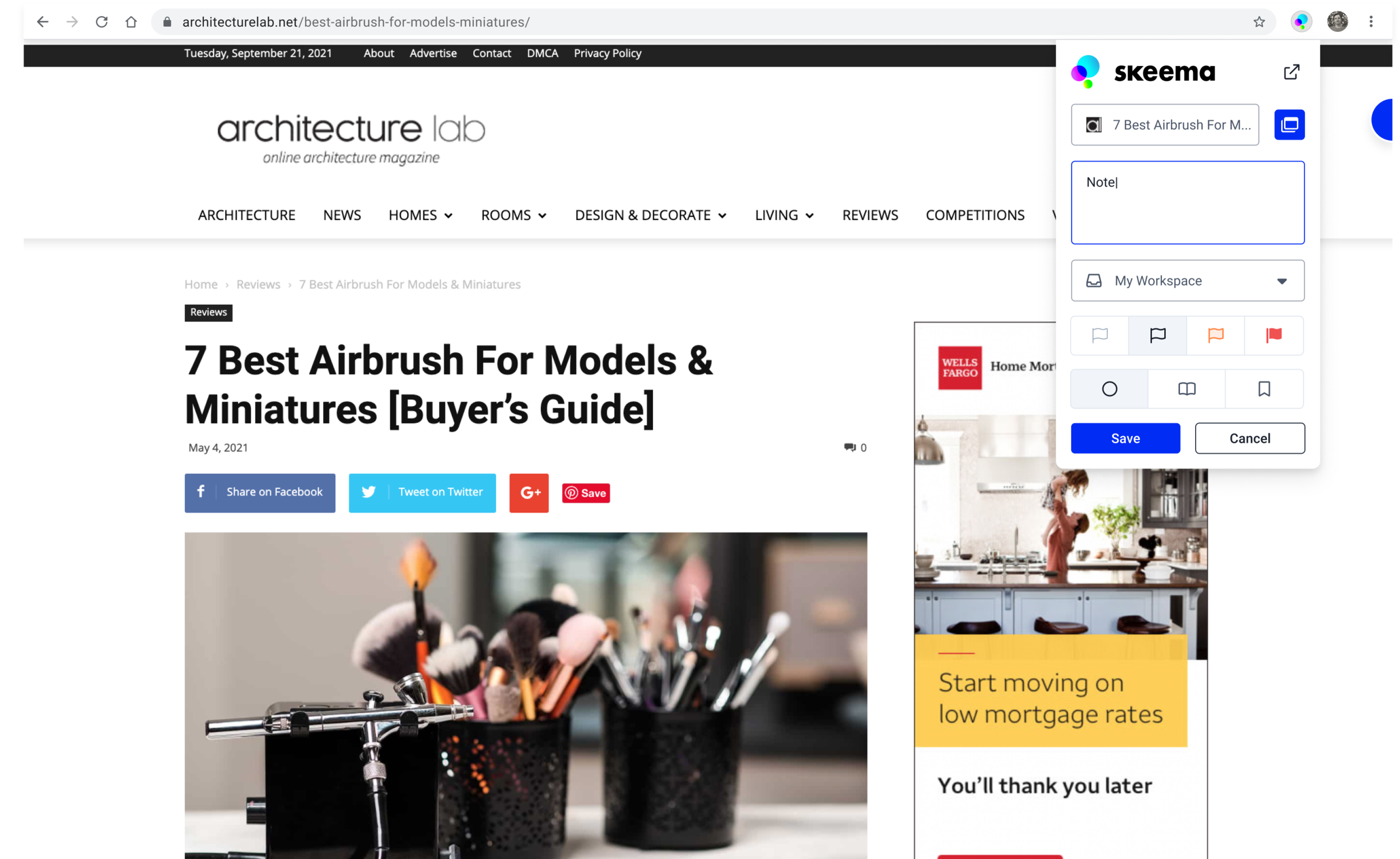
Introduction to Skeema
Saving tabs as a new group to the Workspace.
Switching to a different project and re-opening saved tabs
Adding notes and changing the priority of a saved tab
Tour Points
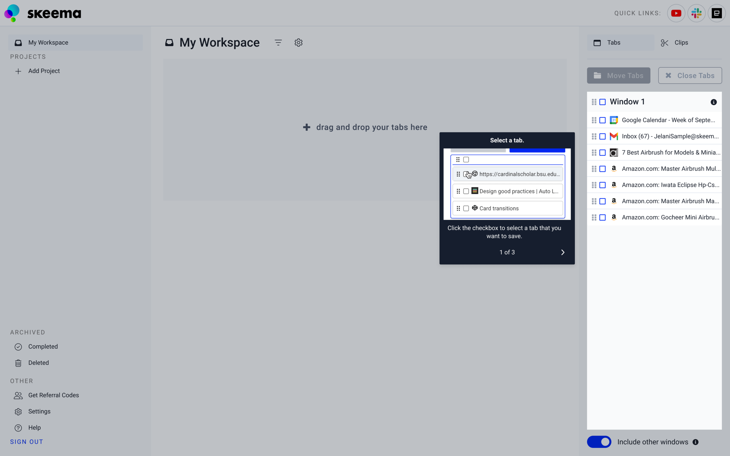
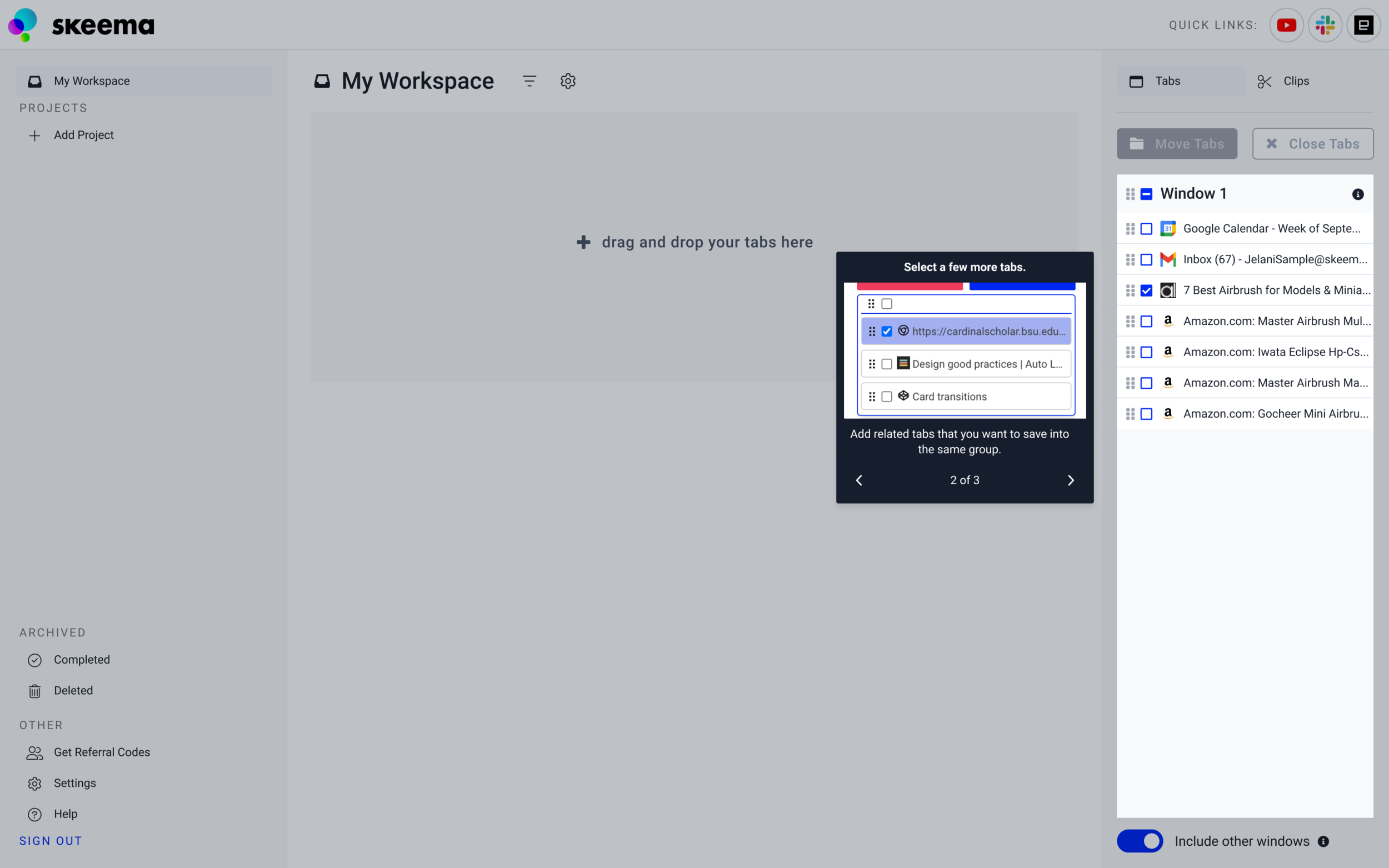
Tour points were implemented in a way that instructed users on the basics of selecting and saving tabs.
Users could either dismiss the tour points manually, or they would automatically proceed if the task in the tour point was accomplished. Animated GIFs were added to the tour points to demonstrate these actions.
Selecting a tab - User can either click the arrow or select a tab in the right panel to continue.
Selecting multiple tabs - User can select more tabs or just click the arrow to continue.
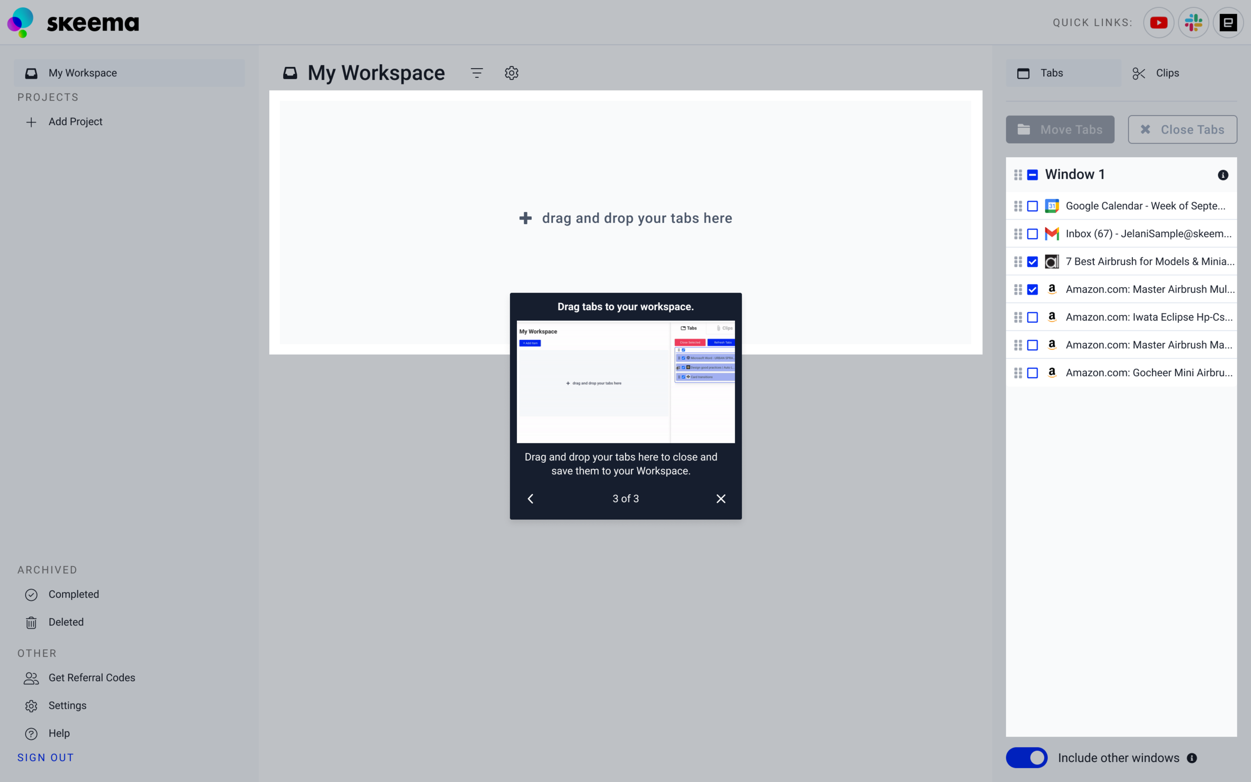
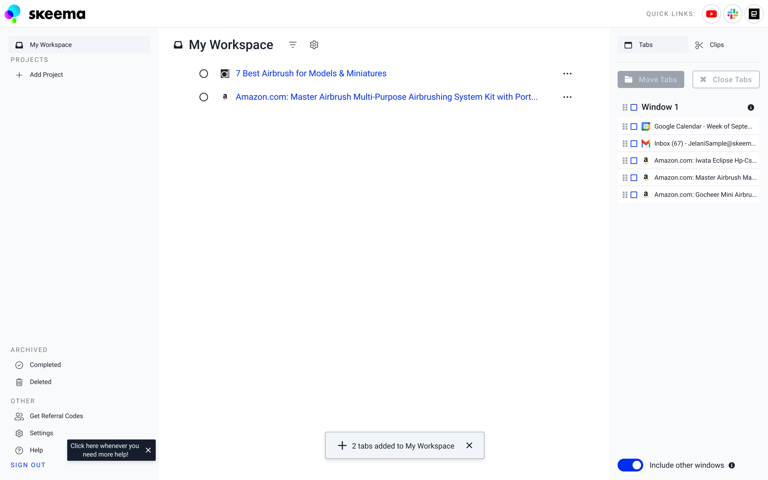
Moving tabs to the Workspace - Users can complete the onboarding process by moving their selected tab(s) to the drop area of the Workspace or click the X to dismiss tour points.
Help Link - After tour points have been completed, a dismissible tool tip will appear next to the Help link to let the user know where they can access additional support if necessary.

Next Steps
We will need to conduct more interviews and shadow users during the onboarding experience to measure the impact of our design changes.
We will ask questions to newcomers such as “What is Skeema for?” and “How do you use Skeema?” to gage the effectiveness of our new onboading process.
We may need to identify other parts of the product that users are having trouble with and add conditional tour points to assist them.
Analytics
We should track the rate of uninstalls after implementing these changes to see if users are still abandoning the product.
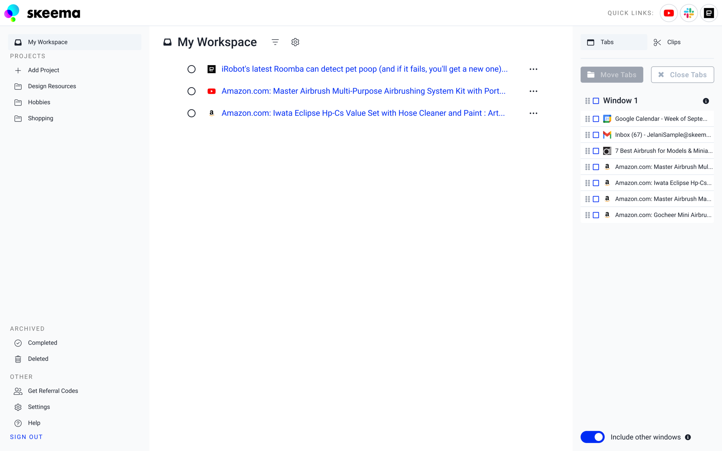
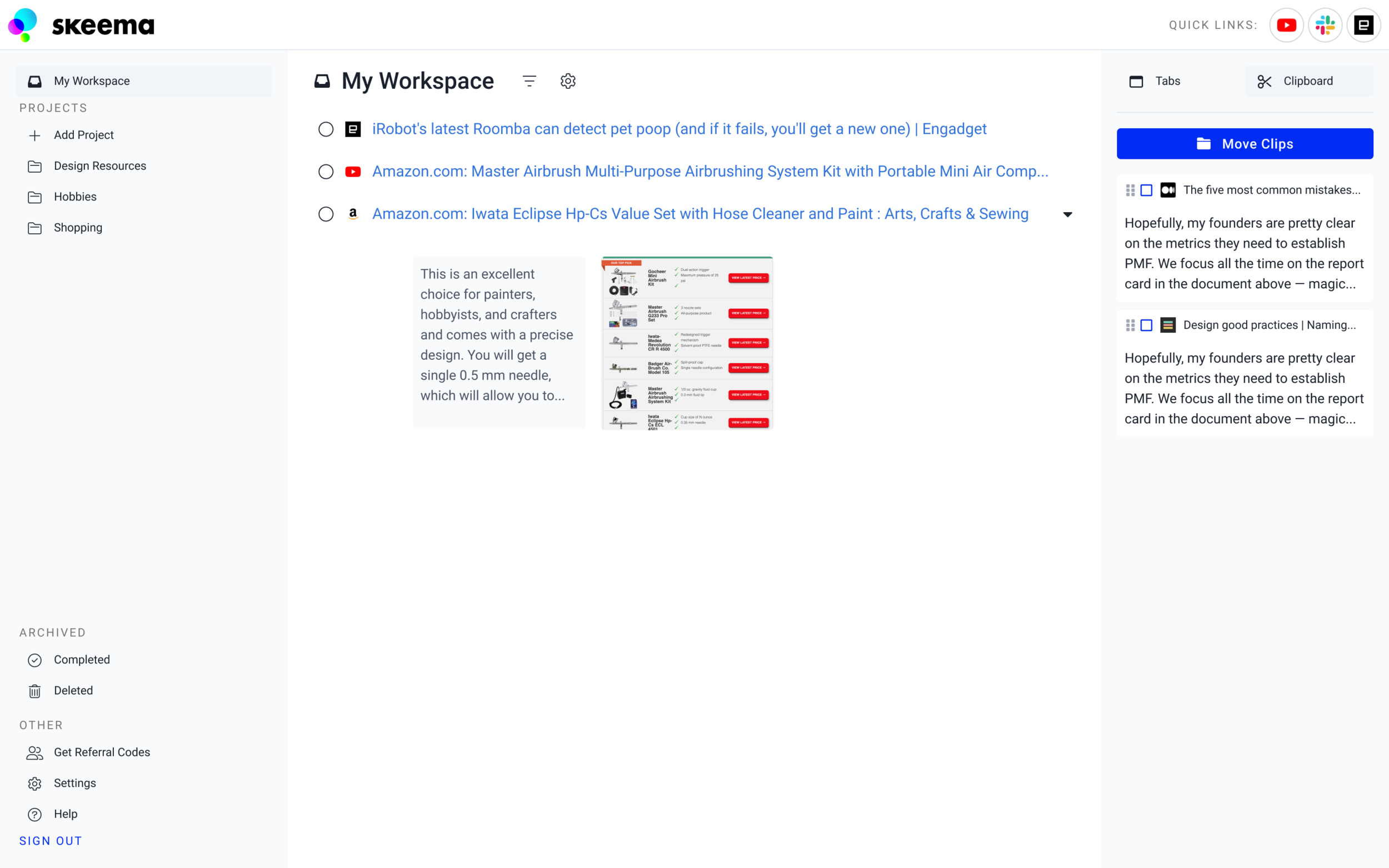
Managing Tabs
Users have a view of their currently open tabs in a panel on the right. Moving a tab to Skeema closes the open tab.
Feedback: Dragging and dropping one tab at a time was awkward and time consuming.
Insight: Analogous product research provided inspiration for familiar multi-selection patterns when dealing with a large number of items.
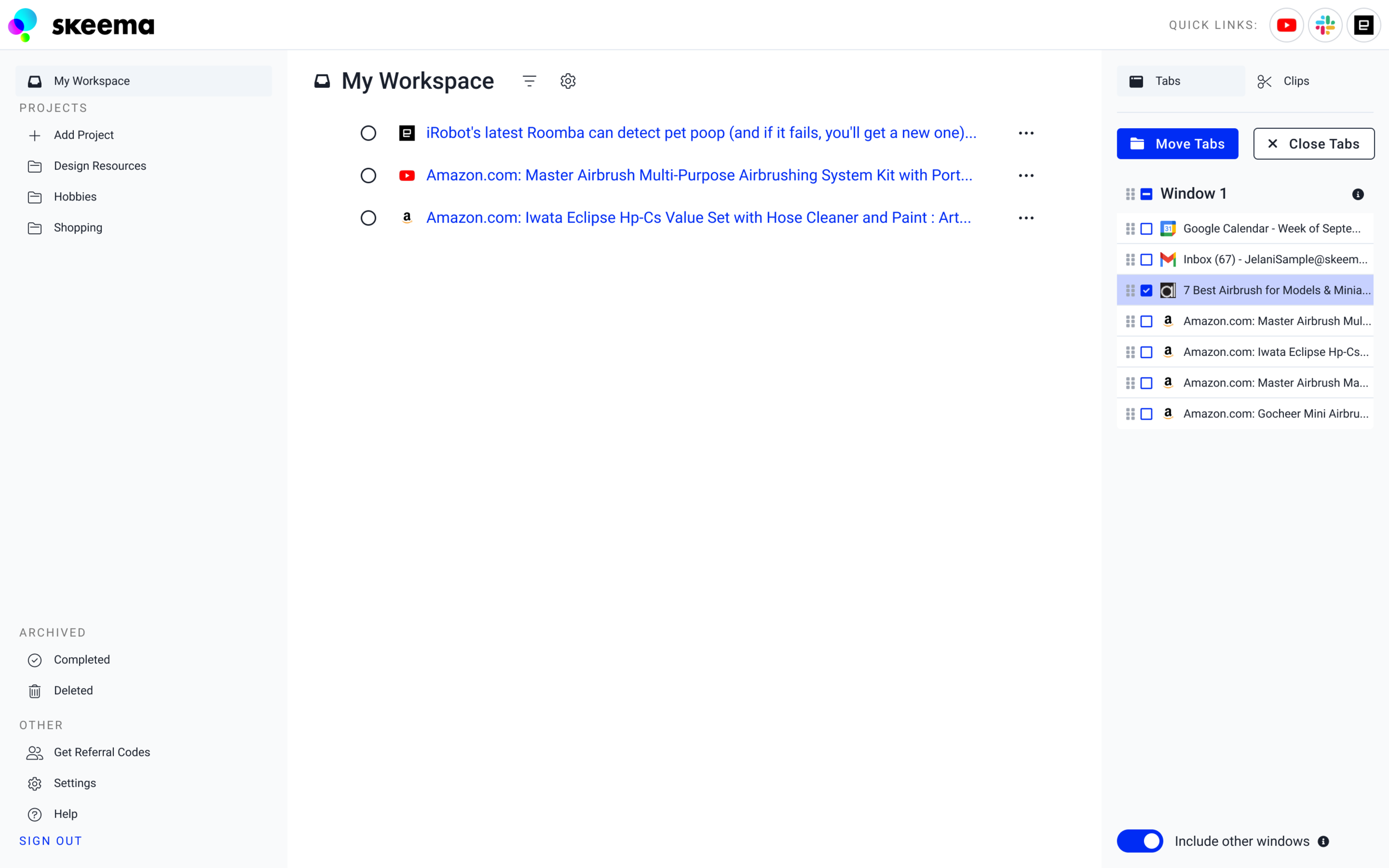
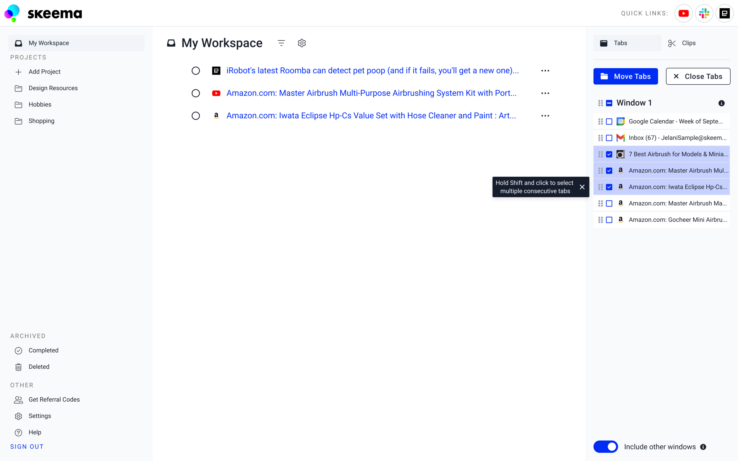
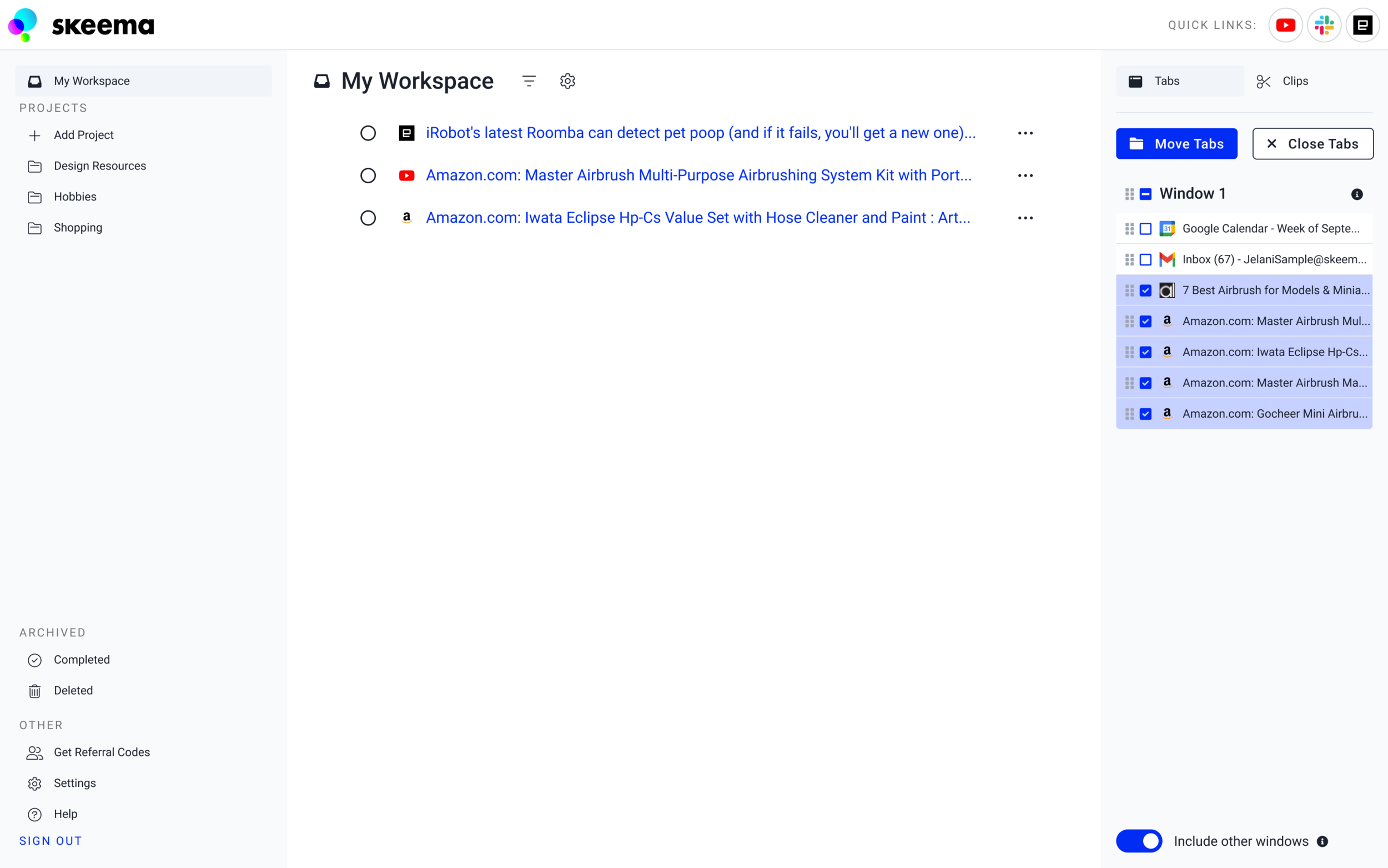
Selecting Tabs
Instead of having to drag and drop tabs individually to their desired locations, checkboxes and a “Move Tabs” button were added so that users could select multiple tabs and move them to the same area.
Default - No tabs selected
One tab selected by clicking the checkbox
After the user selects multiple tabs for the first time, a tool tip will appear to inform them about holding Shift to select multiple consecutive tabs
Multiple tabs selected
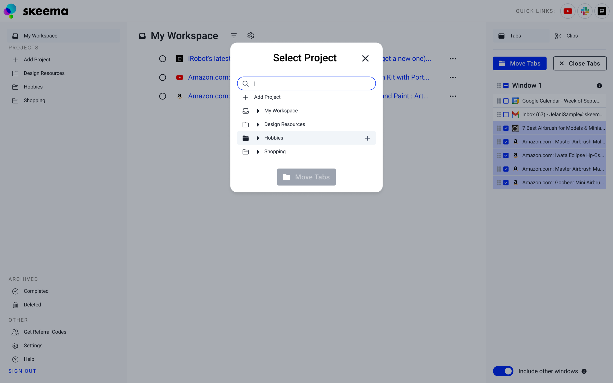
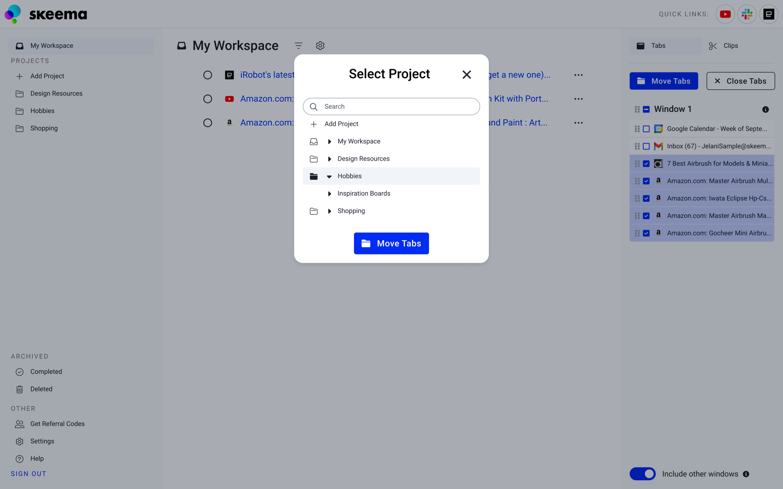
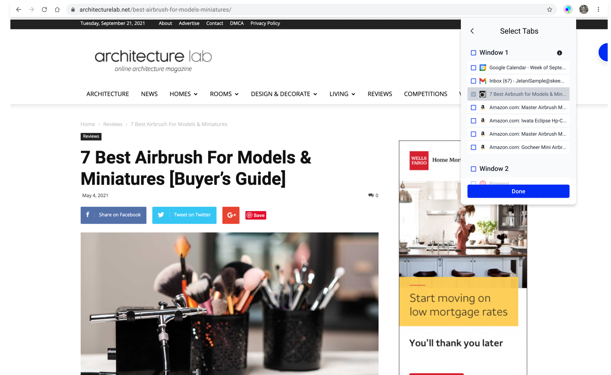
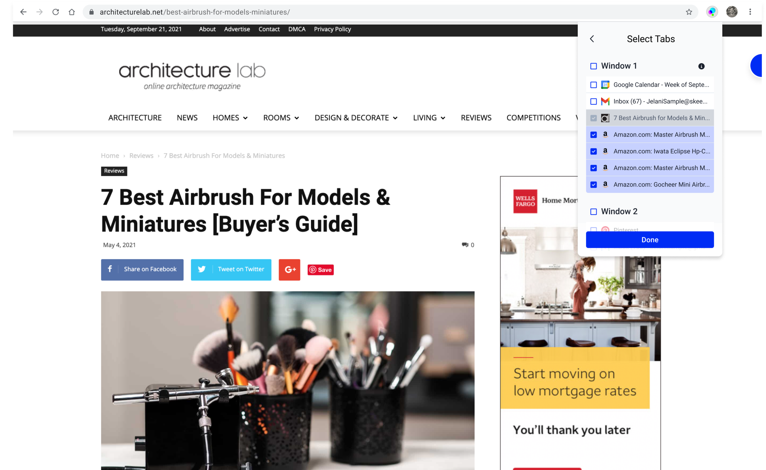
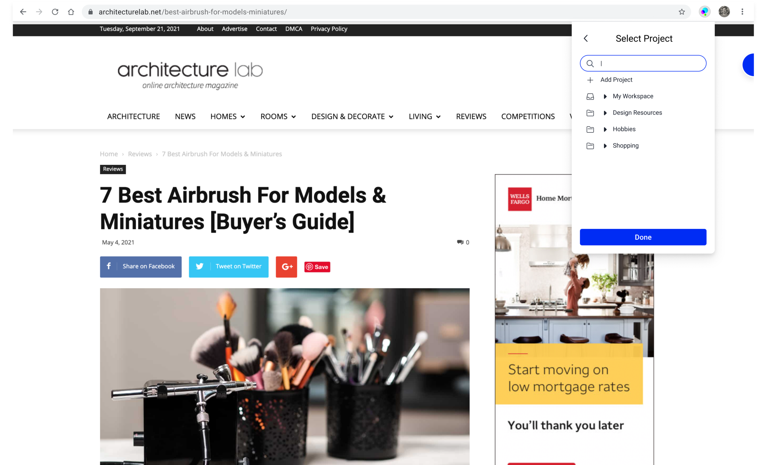
Project Selector
Upon clicking “Move Tabs”, this modal appears and allows users to select the destination for selected tabs.
Search bar is active by default to let the user search for existing projects or groups within projects. The most recently created project will be selected by default.
Projects can be expanded to display groups within.
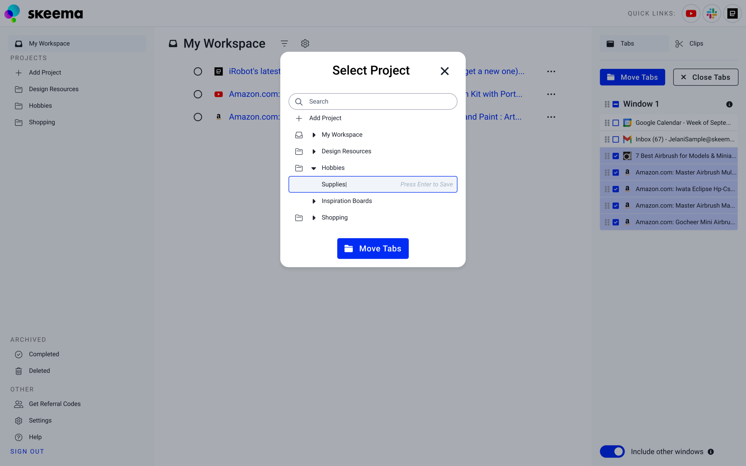
Hovering over a project and pressing the plus icon on the right will add a new group to that project. When creating a new group or project a form field will appear in the active state so the user can quickly enter a name.
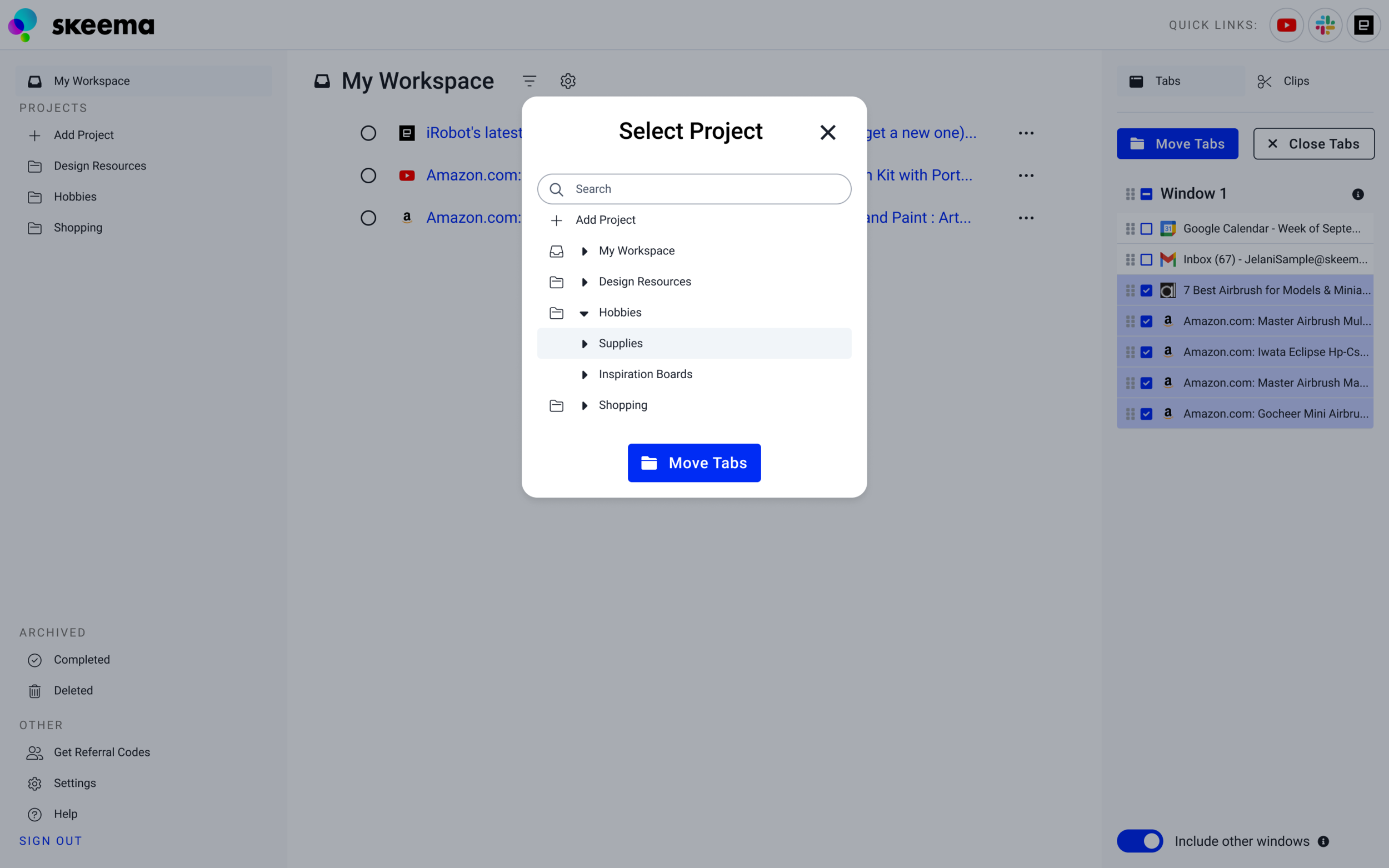
The user can press Enter to save the name of their new group.
The newly named group will be selected. Pressing “Move Tabs” will save the selected tabs to this group.

Tool Bar
These same interaction patterns were applied to the Skeema chrome tool bar pop-out.
Default state of tool bar pop-out
The user can select other tabs they have open from this list. The tab they are currently on will be selected.
The user can select multiple tabs the same way they would in the Skeema app
State of tool bar pop-out when multiple tabs are selected
Project selection from tool bar pop-out
Tool bar pop-out with project selected


Next Steps
In order to measure the success of these design changes, more interviews should be conducted to survey user’s thoughts on the new tab-moving interface as it compares to the old drag-and-drop technique and which technique they prefer.
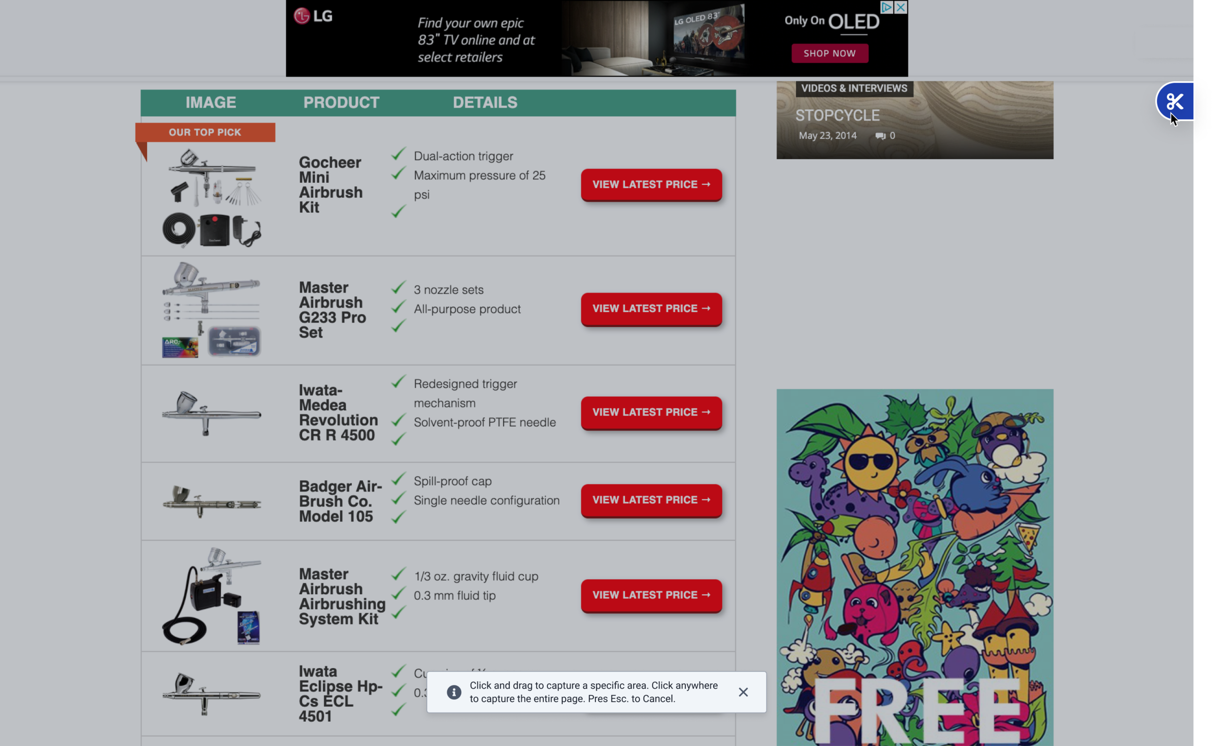
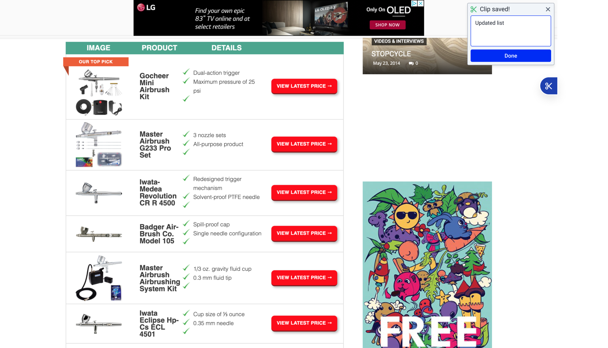
Clipping Web Content
Skeema’s clipping tool allows users to save screenshots and pieces of text
Feedback: Users were having trouble accessing and using the image clipping feature.
Insights: Analogous research in the form of other chrome extensions informed us about how to decrease the friction of activating the clipping tool. Competitive research informed the interface of the screenshot tool itself. Our improved onboarding process would be applied to the clipping feature.
Introducing the clipping tool to new users
In order to create awareness and provide instructions, first-time Skeema users are introduced to the clipping tool the first time they visited a website after installing Skeema. This modal contained a video demonstrating the clipping tool’s features.

Accessing the clipping tool
In order to reduce the friction of accessing the clipping tool, the interaction was reduced to a single hover and click interaction. The tab itself was tweaked to be more visible on dark backgrounds.
Old: Hover, Click, move cursor to clipping tool, then click.

Updated: Hover and click to activate.

Using the clipping tool
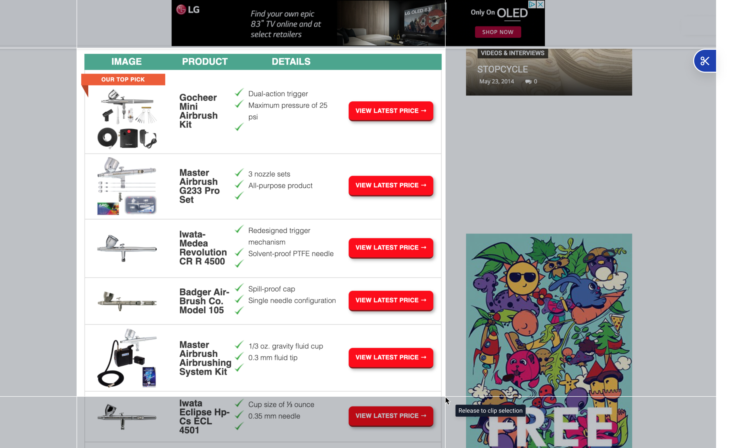
Once the clipping tool is activated, the screenshot-style interface should be familiar to users.
Click once to capture the whole page.
Hold click, drag, and release to capture a specific part of the page.
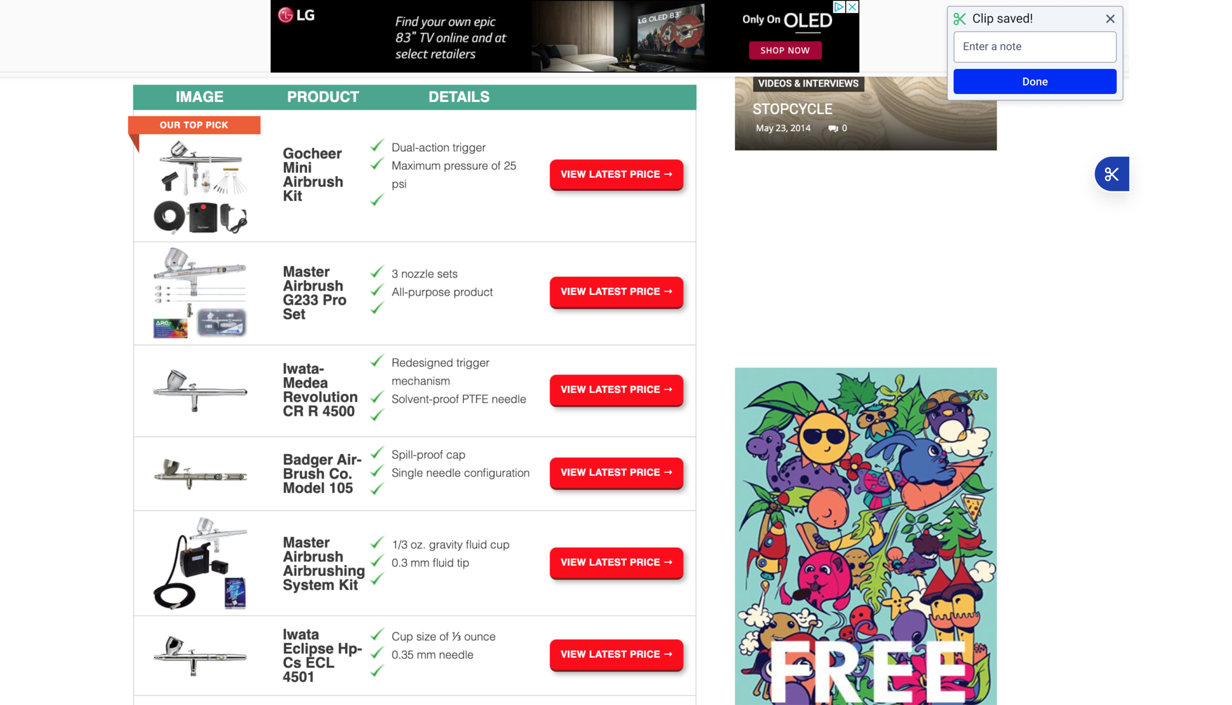
A confirmation message lets the user know their clip has been saved.
The user can add a note to add a description for the saved clip.
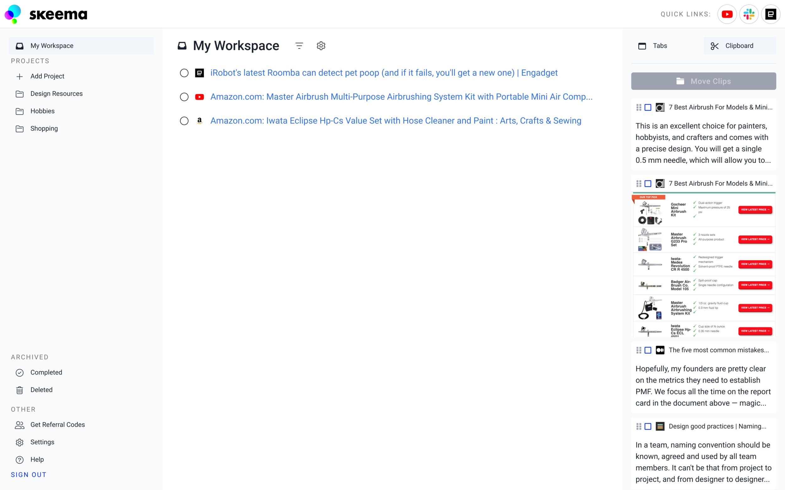
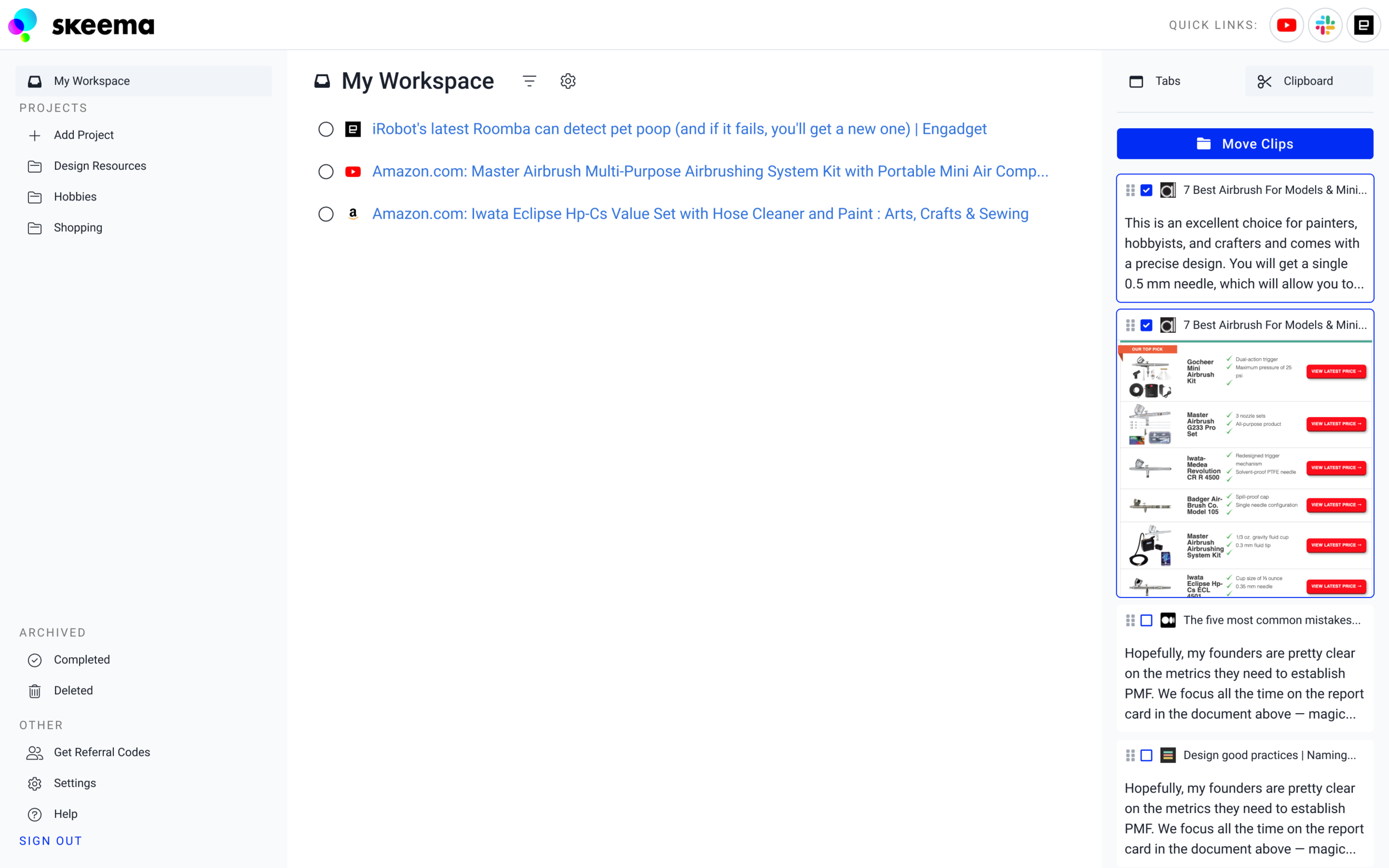
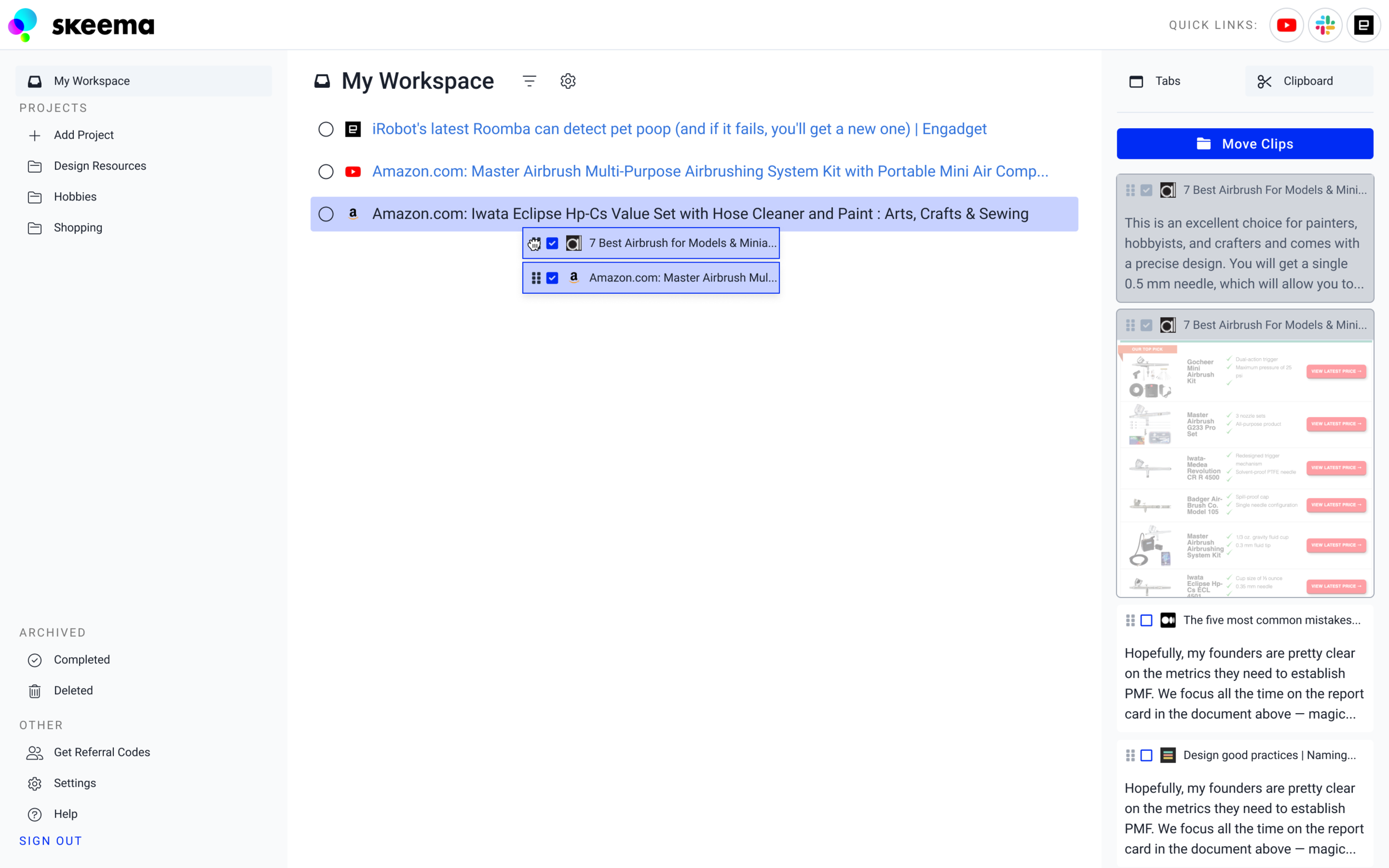
Adding Clips
Saved clips can be added to projects by selecting them from the clips panel and dragging them to the desired destination or pressing “Move Clips”.
Default - No clips selected in clip menu in right panel
Multiple Clips Selected - The user can click on the checkboxes to select multiple clips
Moving Clips - Users can drag and drop clips on to saved tabs to create a new group out of the tab.
Saved Clips - These clips have been added to saved tab within the Workspace.

Results
We conducted user interviews after the launch of the clipping feature to gather more feedback and see how users were utilizing the new tool. Users liked using the tool to add visual associations to tasks such as deciding what kind of shoes to purchase, as well as saving images of charts or diagrams for academic research.
Link Previews
We found that some users were clipping and saving images as a way to create “previews” for the associated link, making it easier to remember the content of saved pages. This feedback revealed a weak spot in how we were handling previewing saved tabs.
More Control
Users also wanted the same kind of priority and status controls that come with saved tabs.
Design System
As new designs were approved, I componentized new UI elements and added them to our growing library of parts. This was done habitually to maintain consistency and create a catalog of patterns with descriptions for developers and future designers on the project.
Example of Saved Tabs documentation:

What’s Next?

Reduce Manual Interactions
Experiment with organizing tabs by search queries and automatically scanning web pages to pre-clip content.

Gather Feedback
The team will continue to gather feedback and test prototypes for new features.